Job search and candidate experience
Product & Experience Design

Context
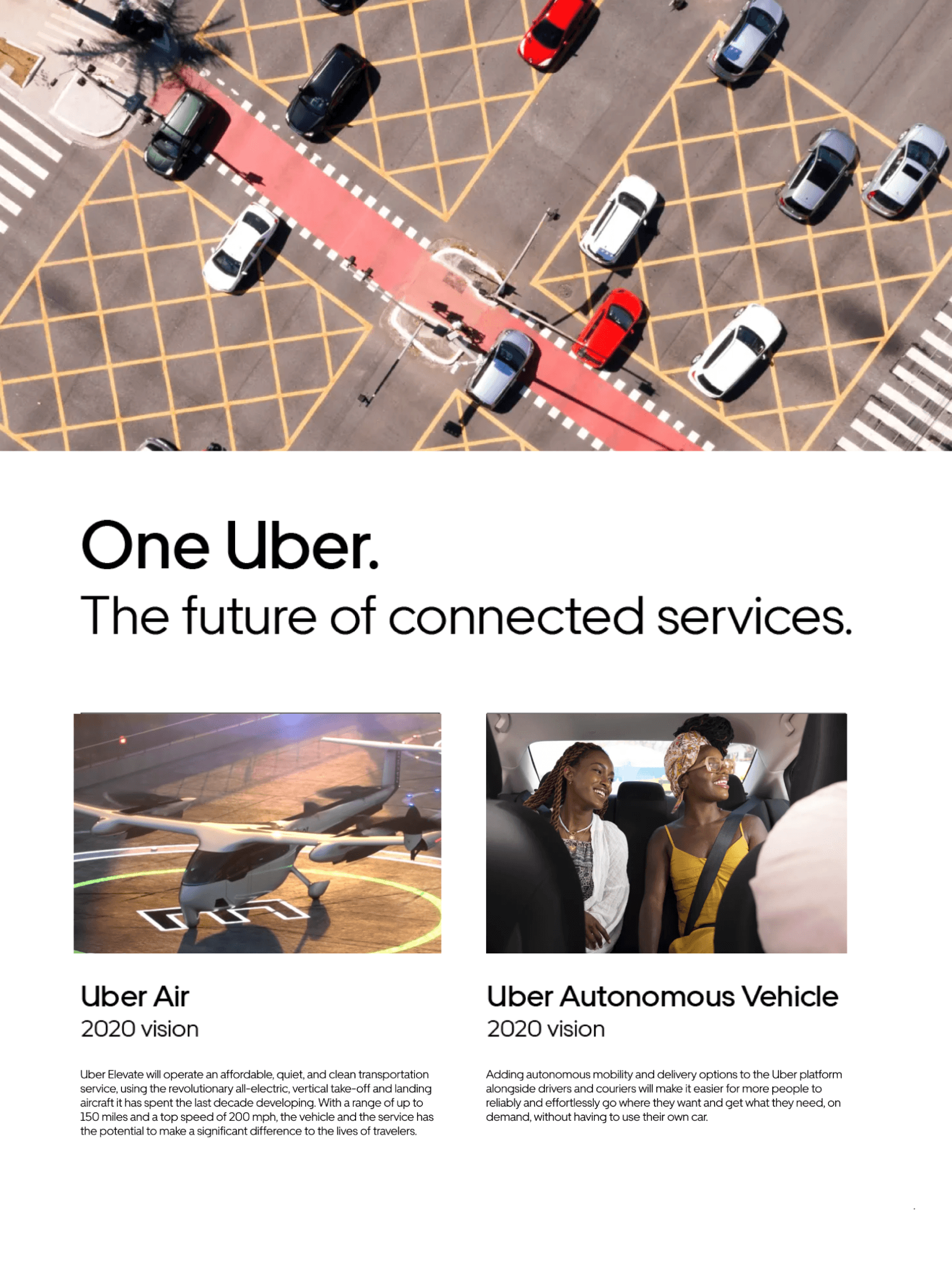
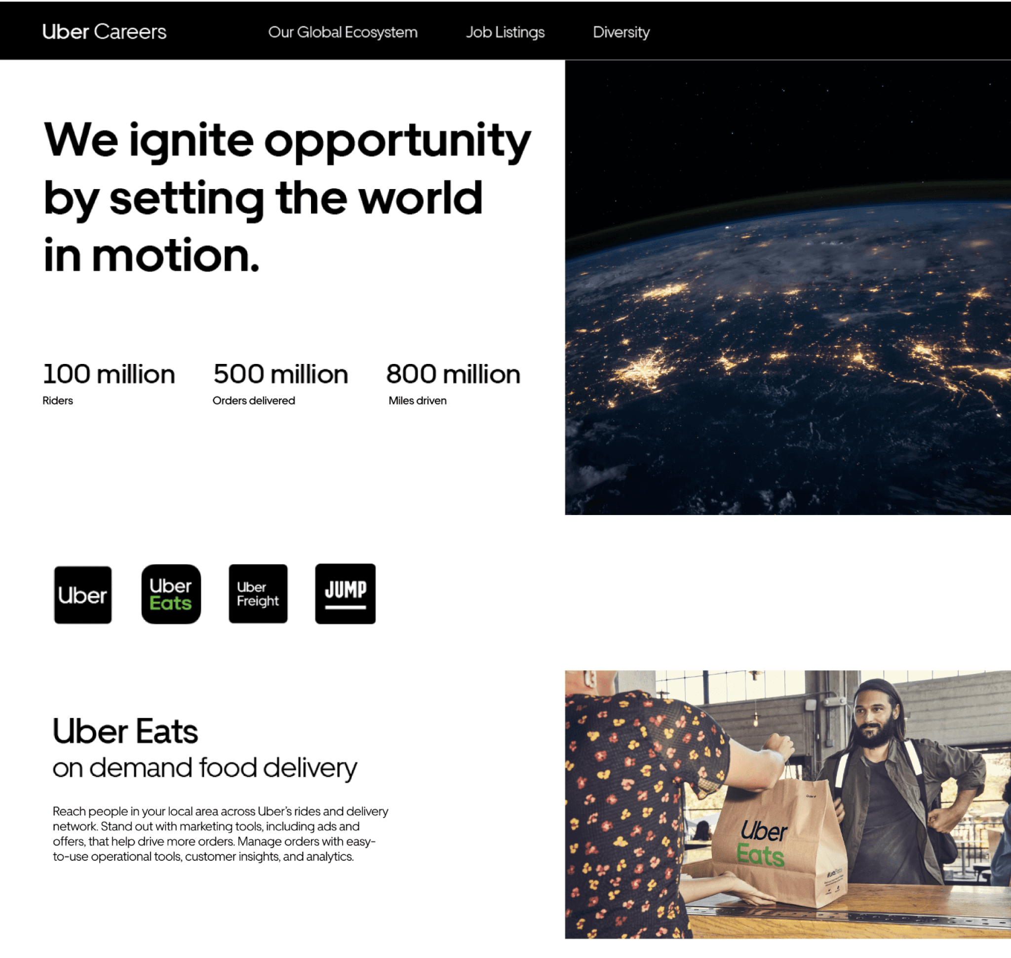
The product side of Uber underwent a massive redesign in 2018. Uber Careers needed to match the product refresh. Our team was one of many that assisted in this process. We focused on the overall candidate experience.
Problem
Apart from matching the product redesign, Uber Careers had usability and messaging issues. There was friction in the overall candidate experience and hiring rates were low due to a negative brand perception.
Goal
The Employer Brand and Marketing Team’s goal was to increase hiring rates, improve brand perception, and reduce friction in the candidate experience process.
Timeframe
Nov 2018 – Aug 2019
My Role
Research and Prototyping
Platforms
Web & Mobile
Industry
Tech & Rideshare
Outcomes & Results
Through our prototype testing methods we found that candidates had a 44% better perception of the brand overall. Our skimmability feature saved 35% of total time while browsing through multiple jobs and 55% of users indicated better transparency and a better understanding about the hiring process.
Our prototypes for job descriptions didn’t get deployed but our comprehensive internal and external research and competitive analysis was used to influence marketing decisions for the talent brand.
keep scrolling to see the design process
Understanding how to position the brand
We wanted to understand what went into the decision to apply to a company and work there for people at different points in their careers. We also looked into how our competitors marketed themselves to understand if there was a gap in the market that we could fill.
Methods
Usability Studies
Individual Interviews
Focus Groups
Clickstream Analysis
Sample Size
40 participants
50 competitors
140 internal jobs
User Groups
Students & Entry Level
Experienced Hires
Changing Careers
Tools Used
Google Analytics
Google Sheets
92%
92% of candidates felt left in the dark after they submitted a job application.
Call for
Transparency
73%
73% of candidates felt inconsistencies across job descriptions created a time-sink in their lives.
Call for
Consistency
95%
95% of candidates had a negative perception of the brand due to past lawsuits.
Call for
Accountability
62%
62% of candidates felt there was a toxic work environment at Uber.
Call for
Trust
Turning research insights into reality


Uber Careers Re-brand

Insight
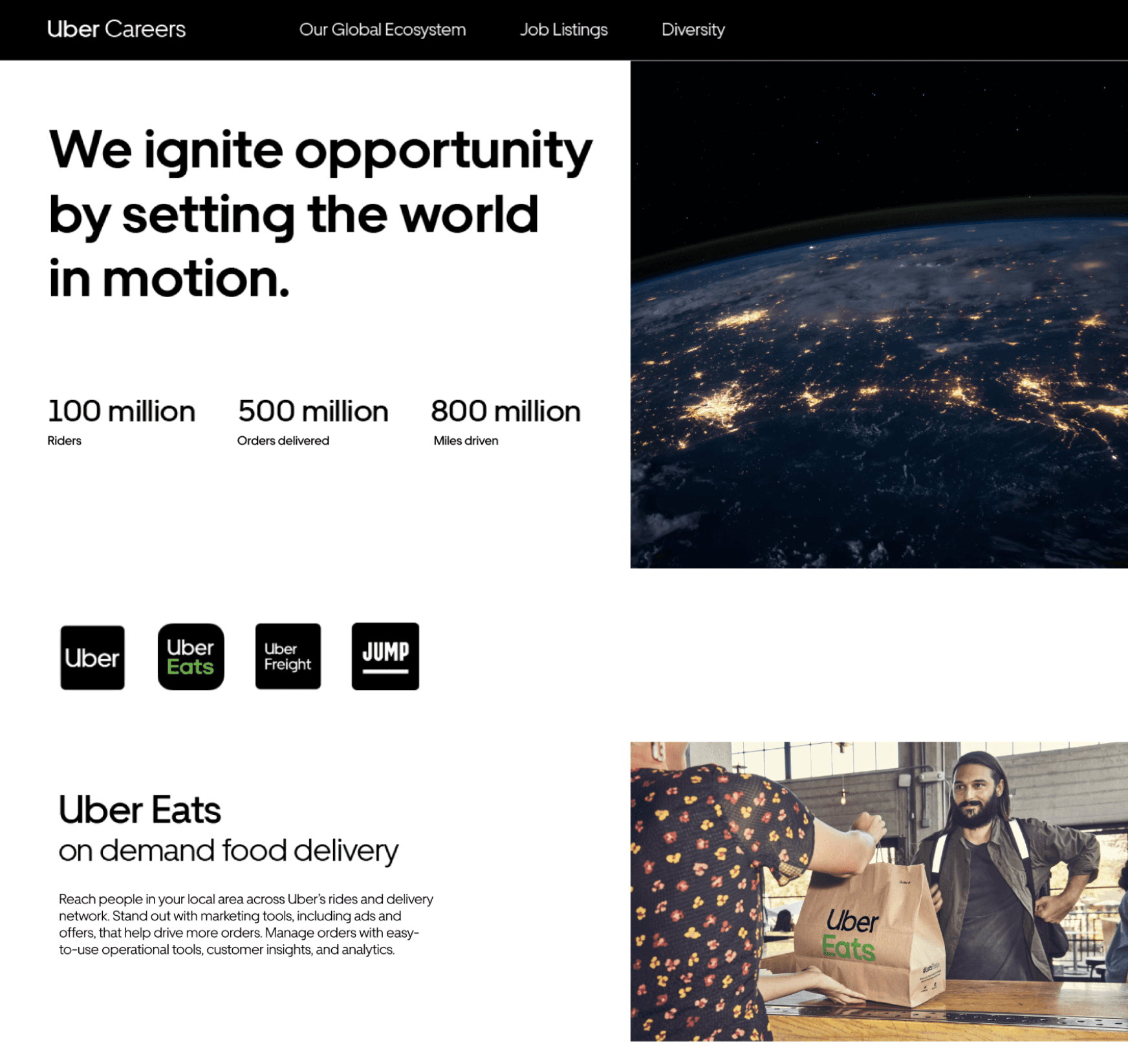
The careers page was outdated and needed a refresh to match the product rebrand and to indicate a change in company culture.
Solution
Highlight how Uber is “moving forward” from past leadership and generate excitement about existing and upcoming initiatives
Results
22% of users indicated an increased interest to proceed to job listings from the careers page (from prototype testing sessions).
Improving Brand Perception – Moving Forward
There was a reduction in the number of candidates applying due to a negative perception of Uber’s culture. Our goal was to embody Uber’s motto of Moving Forward across the website in small yet meaningful ways.
Transparency in the process
Insight
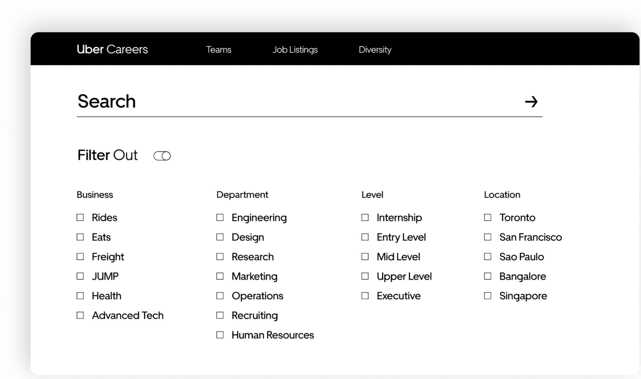
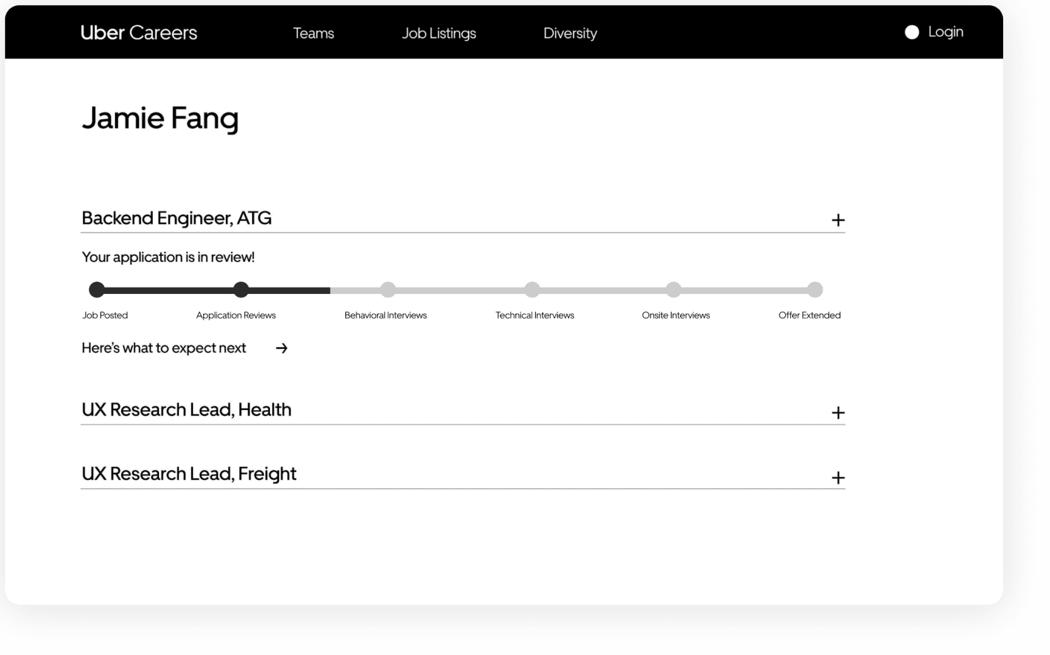
Candidates felt left in the dark after they submitted an application.
Solution
Application tracking system with real time updates about progress.
Results
55% of users indicated a better understanding about the process (from prototype testing sessions).
Consistency and ease of use

Insight
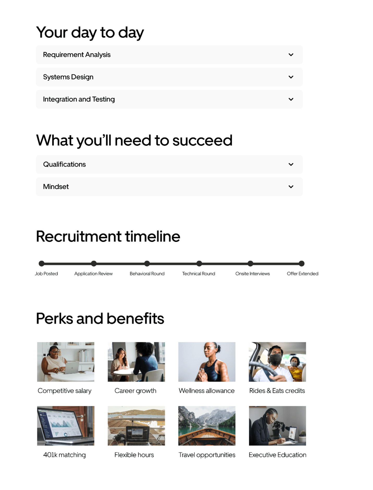
Candidates felt inconsistencies across job descriptions created a time-sink.
Solution
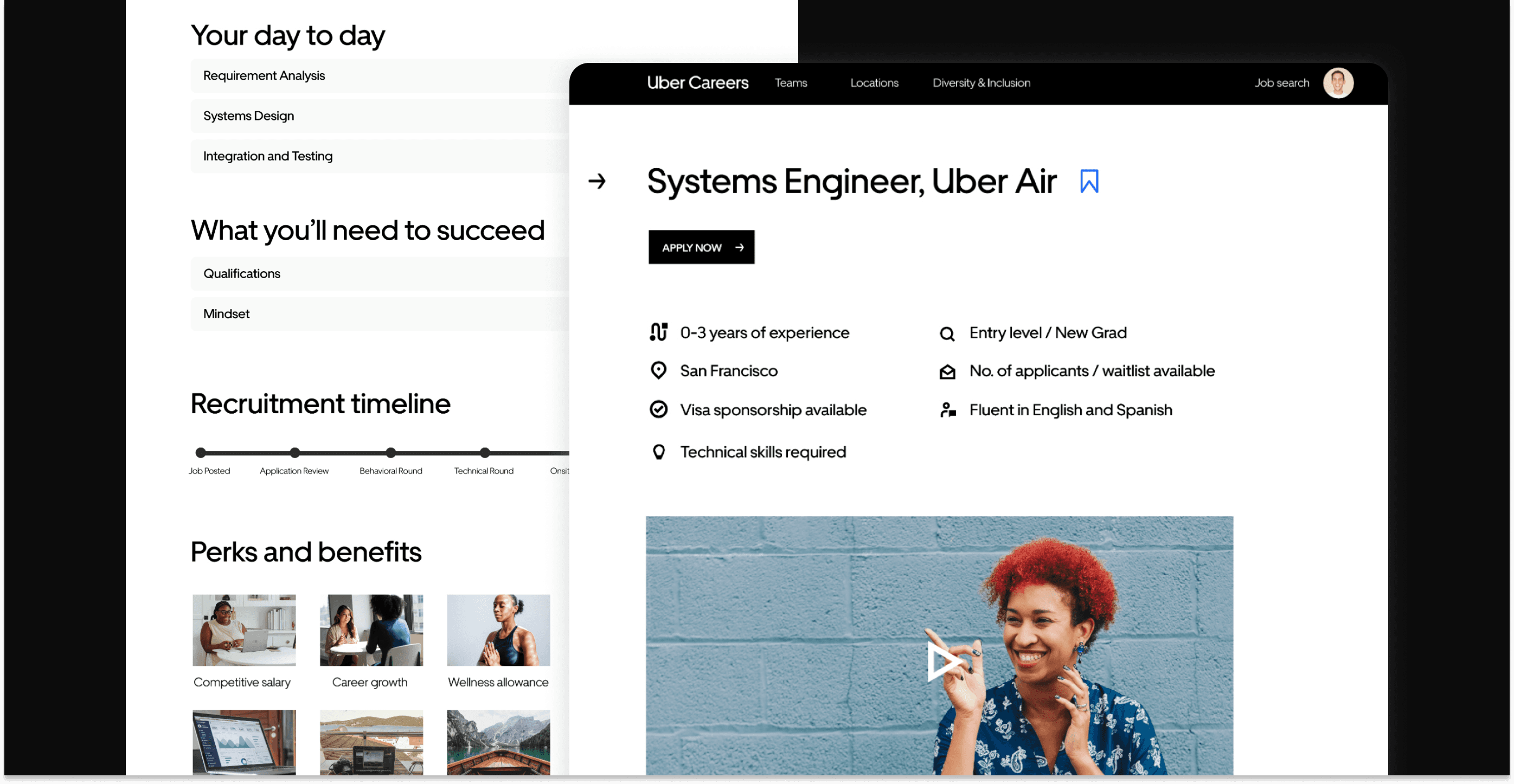
Surface crucial information in a skim-able and consistent format along with a video job description made by the team.
Results
35% of total time saved while browsing through multiple jobs (from prototype testing sessions).

Insight
Candidates indicated that it was challenging to clearly understand requirements & qualifications for a job
Solution
Toggle lists with clear headlines and bullets to reduce cognitive overhead.
Results
15% of users indicated improved skimm-ability (from prototype testing sessions).
Putting candidates first


Insight
Candidates didn’t feel supported in the job search process.
Solution
Offering resources within each job description to help create an environment where the applicant can feel heard and is set up for success.
Results
20% of users indicated a better supported during the job search process (from prototype testing sessions).
Building trust
Insight
There was a lack of trust in Uber as an employer. Candidates felt that Uber had a toxic work environment.
Solution
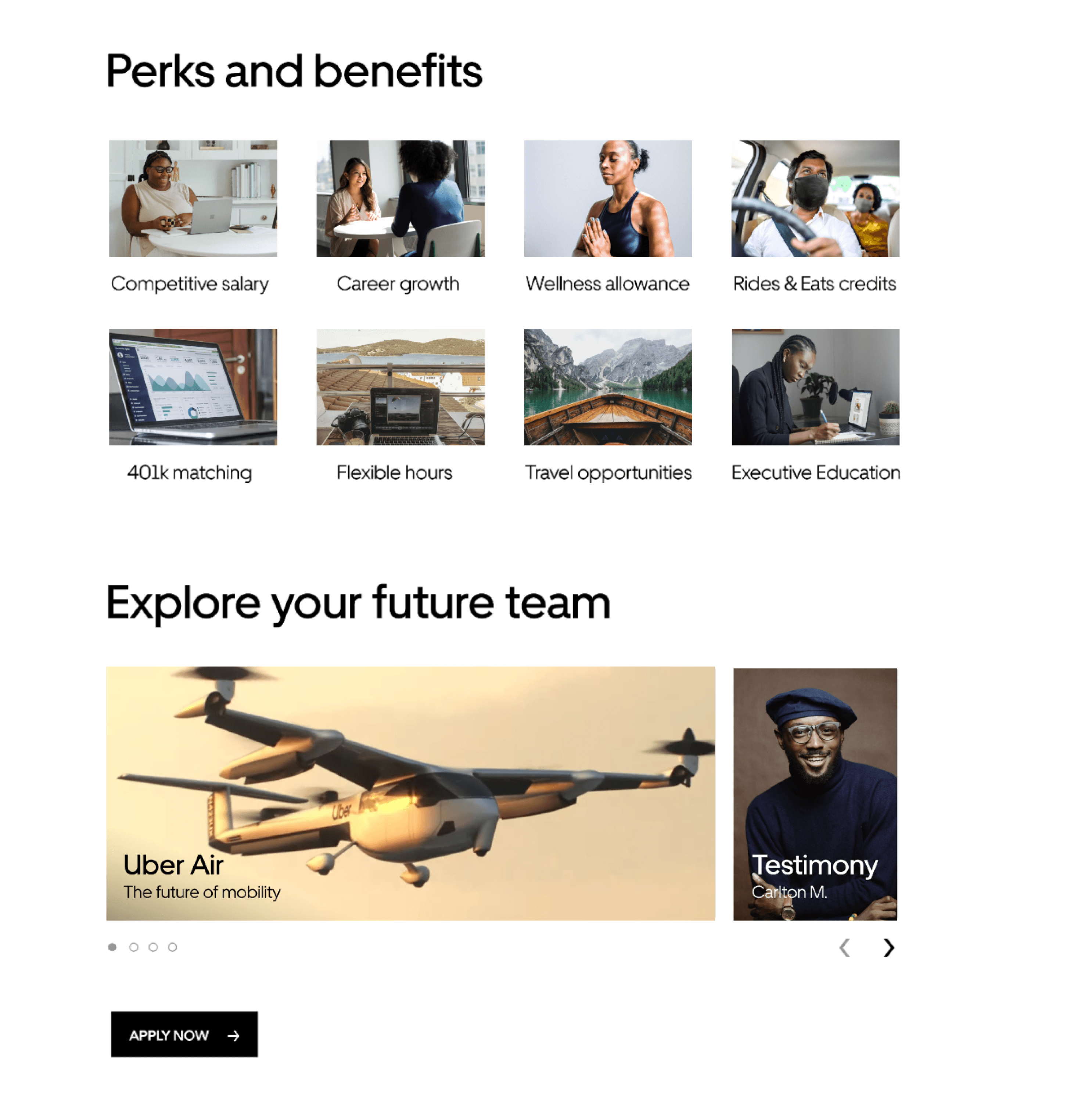
To build back trust we wanted candidates to know exactly what type of role and company they were applying to. Clearly defining the recruitment timeline, perks, as well as team culture up front sets the tone from the get go.
We wanted to be transparent in our values and our offerings. Showcasing each roles unique offering on their respective job description helps push the narrative of Uber’s changing culture embodying the new motto of “Moving Forward”.
Results
44% of users indicated a better perception of the brand overall. (from prototype testing sessions).
Key Learnings
Matching business needs and user needs
It’s a delicate balance trying to ensure your user needs align with the business goals and budget. Through this project I learned the importance of being able to sell your ideas to management and present metrics that management cares about.
Implementation infrastructure
Your design work is useless if there’s no effective plan to implement internal process changes that support your work. Bringing teams and stakeholders on board requires a lot of internal networking and slide decks.
Quality over quantity for research
When time is up against you and management says there’s no time for research, you need to focus all your energy on the quality of research over the quantity of the sample size.
Outcomes
Through our prototype testing methods we found that candidates had a 44% better perception of the brand overall. Our skimmability feature saved 35% of total time while browsing through multiple jobs and 55% of users indicated better transparency and a better understanding about the hiring process.
Our prototypes for job descriptions didn’t get deployed but our comprehensive internal and external research and competitive analysis was used to influence marketing decisions for the talent brand.
Where I lent a hand

Talent Branding: LinkedIn cover photos for the recruiting team
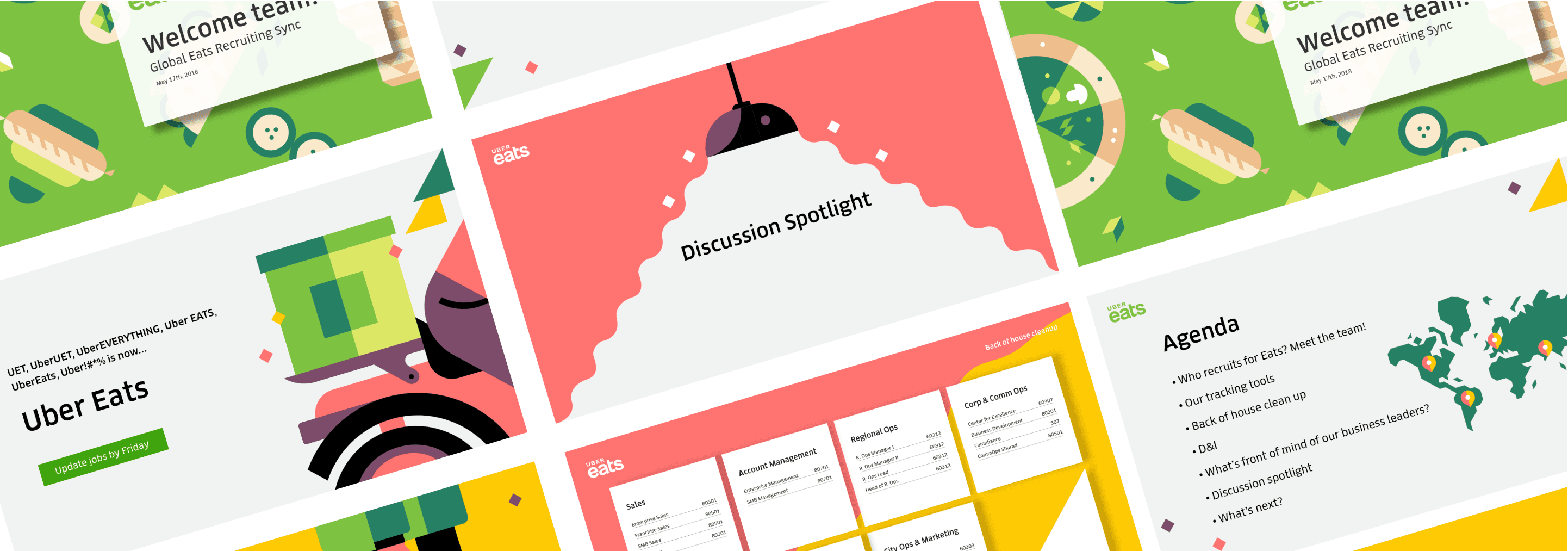
Communication Design: decks and email marketing for the recruiting team (note: this is before the re-brand)

Event design: created assets for Abby x Uber as well as Product Team events
Let’s build thoughtful interactions for people together, let’s chat.


