User onboarding and retention experience
Interaction Design & Product Launch


Context
Metropolis was launching their new product offering called the Podarchy Explorer in 2022. It was building off of their core product of “Pods” which are specialized working groups commonly used by crypto organizations called DAOs (decentralized autonomous organizations).
Problem
There was friction in the existing onboarding process of Pods and we didn’t have a path / flow that lead users to the new feature - Podarchy Explorer.
Goal
Create a seamless onboarding experience for new and existing users and ensure a frictionless process for the new product feature launch.
Timeframe
Feb - November 2022
My Role
User Research
Product Design
Platforms
Web & Mobile
Industry
Crypto
Outcomes & Results
Based on user testing sessions, we found that our new onboarding flow increased user adoption by 45%. Additionally, the new explore experience increased user engagement by 20% and a subsequent increase in traffic to
the new product offering – Podarchy Explorer. We saw an increase in engagement from both new and existing users with a significant increase in traffic from new users.

keep scrolling to see the design process
Understanding how to increase engagement and retention
We wanted to understand where in the process users were dropping off and why, what the onboarding flow was lacking, and how we could use our site architecture to drive traffic to new and existing features.
Methods
Usability Studies
Individual Interviews
Sample Size
20 participants
10 competitors
User Groups
Crypto Auditors
Technical Operators
Non Technical Operators
Retail DeFi Users
Tools Used
Google Analytics
Google Sheets
65%
Users couldn’t find their profile or their teams. Navigation wasn’t intuitive causing users to drop off.
Call for
Search-ability
51%
Users felt a lack of feedback or confirmation after an action was taken in the app. There was a lack of state updates.
Call for
In-app feedback
45%
When creating or importing a new team, users reported a significant amount of friction and error rates.
Call for
Less Friction
20%
Throughout the app, specifically in onboarding flows, users reported being deterred by technical jargon.
Call for
Accessible Language
Turning research insights into reality

How might we drive traffic to new and existing features?
We started by conducting an internal audit of the whole app, redesigned the site architecture, and evaluated where the new feature would fit into the application. We outlined quick wins along with heavy bandwidth initiatives, and collaborated with the development team to bring the app to life before launch.
Optimizing app navigation
Explore
Manage
Create
Search pods, wallets, and contracts

0x82F...fafe
Explore
Manage
Create
Search pods, wallets, and contracts
Connect Wallet
Action words for key user actions
Non-technical user friendly options
Allowing users to “Explore” pre-login to reduce friction
Pre login
Post login
Dedicated explore page highlighting the new feature
Search with list of featured and recent results of new feature
Reducing app functionality on mobile to reduce cognitive overhead (bad pattern to have these specific features on mobile)
Search optimized for mobile
Limited nesting for ease of use
Profile view (creating a personal connection to the new feature)
whale-global
whale-community
whale-support
whale
whale-publicgoods
Contract
whale-gov
whale-tooling
whale-grants
whale-merch
whale-public
Explore
Your Pods

Ens-metagov

Ens-metagov

Metro-ecosyst...
Try our desktop app to create and manage your pods!


Terms & Conditions
Privacy Policy

0x82F...fafe
whale-global
whale-community
whale-support
whale
whale-publicgoods
Contract
whale-gov
whale-tooling
whale-grants
whale-merch
whale-public
Explore
Your Pods

Ens-metagov

Ens-metagov

Metro-ecosyst...

Ens-metagov

Ens-metagov

Ens-metagov

Ens-metagov

Ens-metagov

Ens-metagov

Ens-metagov

Ens-metagov
Try our desktop app to create and manage your pods!


Terms & Conditions
Privacy Policy

0x82F...fafe
Explore

ens-ecosystem
.pod.xyz

ens-metagov
.pod.xyz

redacted-treasury
.pod.xyz

redacted-community
.pod.xyz

metropolis-contract
.pod.xyz

jamis.eth
0x123...12345

nick.eth
0x123...12345

chappy.eth
0x123...12345

alisha.eth
0x123...12345

julz.eth
0x123...12345

samidefi.eth
0x123...12345

steward.coltr...
0x123...12345

defensible.eth
0x123...12345
Manage your DAO using pods
Pods are a wrapper around Gnosis Safe that help DAOs distribute control to groups of contributors on-chain.
Connect Wallet
Your on-chain source of truth
Turn DAOs into highly networked, legible organizations by connecting hubs of activity in organizations.
Learn More
Explore
Your Pods
You’re not associated with any pods
Try our desktop app to create and manage your pods!


Terms & Conditions
Privacy Policy

0x82F...fafe
Desktop Navigation
Mobile Navigation
Encouraging users to explore and engage
Highlighting different offerings to inform users of what’s possible before any clicks
Creating social proof by highlighting well known crypto organizations that trust our product
Educating users on what’s possible while highlighting core functionality.
Highlighting recognizable users and crypto influencers to entice people to explore
Search and Discover
Organizations


ACL Manager
0x123...12345

redacted-emergency.pod.xyz
0x123...12345

index-delegates.pod.xyz
0x123...12345

ENS-DAO-Governor
0x123...12345

morpho.eth
0x123...12345
Users

monetsupply.eth
0x123...12345

nick.eth
0x123...12345

chappy.eth
0x123...12345

alisha.eth
0x123...12345

julz.eth
0x123...12345

samidefi.eth
0x123...12345

steward.coltr...
0x123...12345

defensible.eth
0x123...12345
Visualize your impact
The Podarchy aggregates all of your pod memberships into one visual interface, giving you a high-level view of your impact across organizations.
Your Podarchy
Manage your pods
As a pod member, you can add or remove members, assign a manager, and even modify pod settings – like changing approval thresholds or pod NFTs.
Learn More
Explore
Manage
Create
Search pods, wallets, and contracts

0x82F...fafe
Guiding tooltips for new users
Search pods, wallets, and contracts
Explore the ecosystem
You can search for DAOs, pods, wallets, safes, and contracts!
Visualize your impact
View all your pods, wallets, safes, and contract connections in one interface.
Manage
Create
Your Metropolis permit hasn’t been issued yet.
You need a Build Permit NFT to access pods. But don’t worry! We’re issuing new permits every week.
Learn More

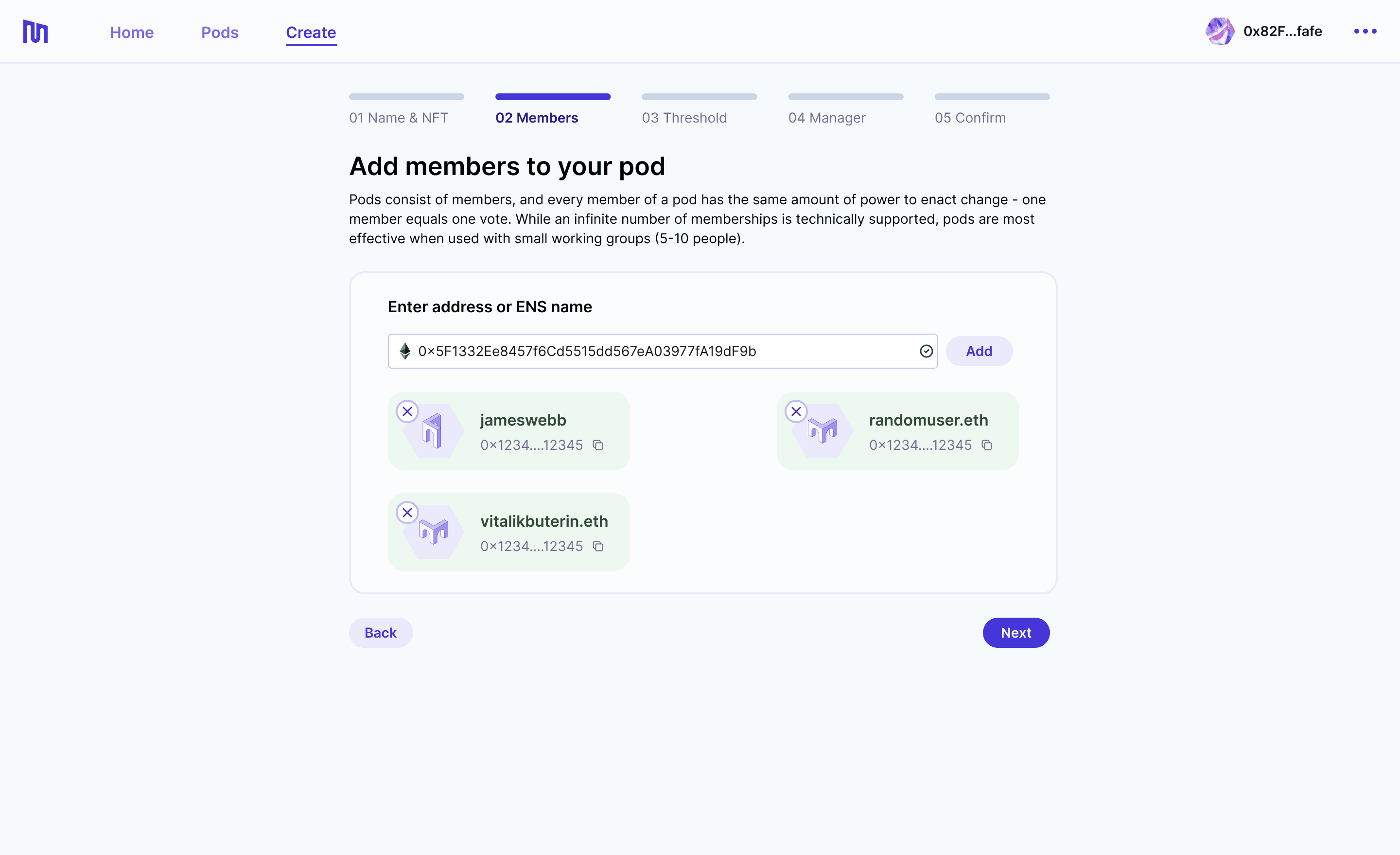


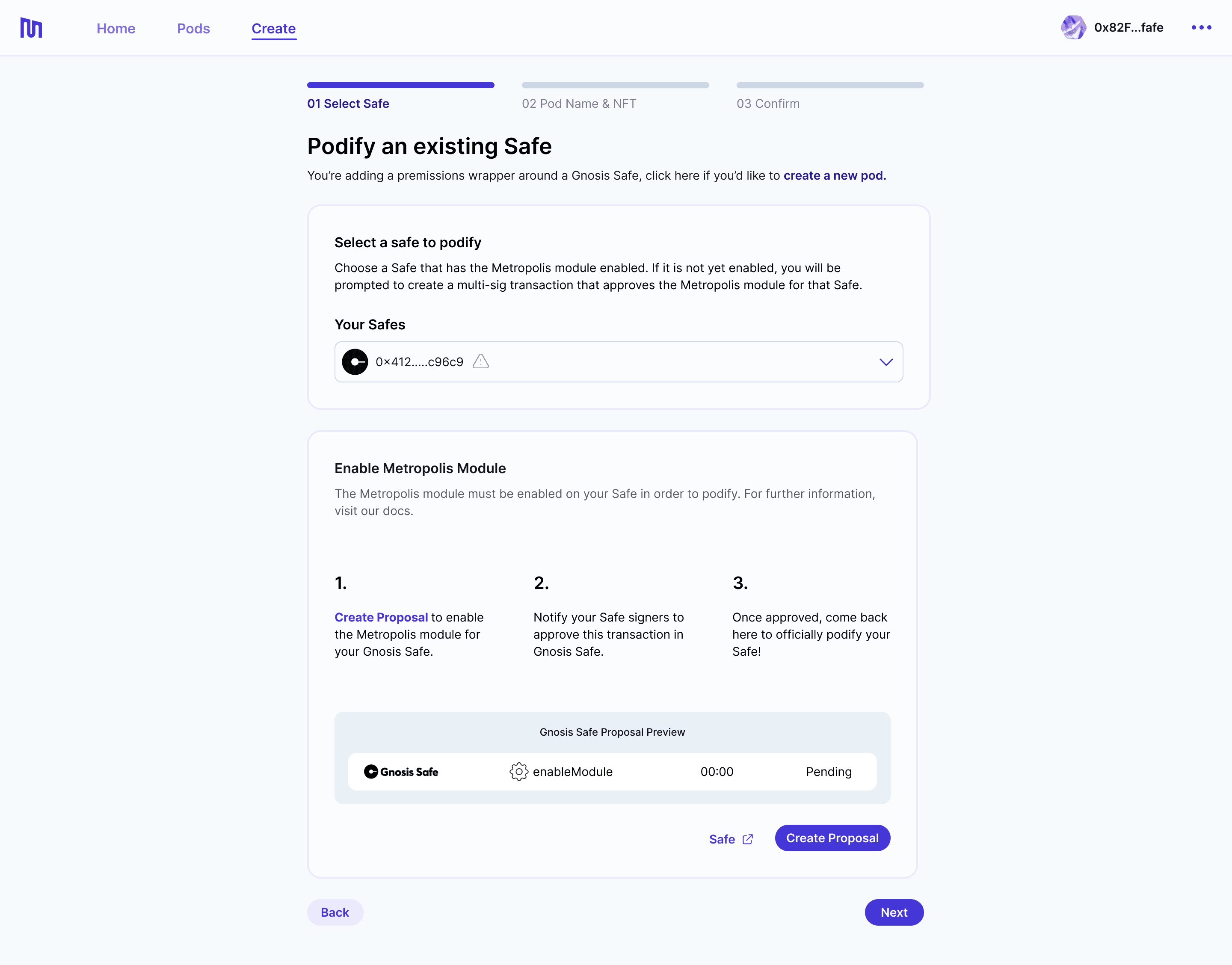


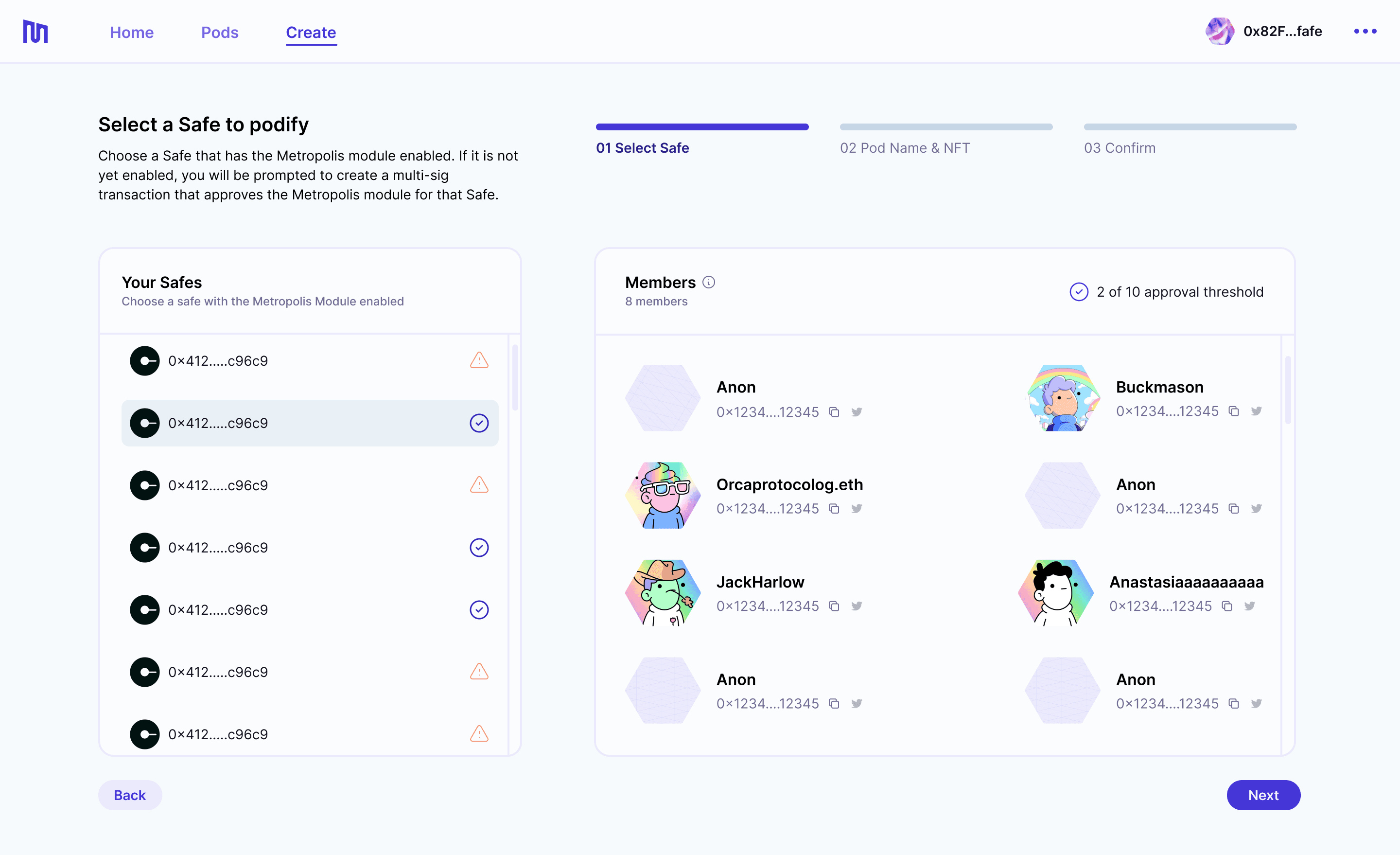
How might we reduce friction in the existing onboarding process?
Based on user testing sessions and feedback we found that our existing onboarding flows to create a new team and to import an existing team were extremely time consuming and error ridden for our users. It wasn’t accessible to our non-technical audience and was resulting in a ton of support tickets.
Importing an existing team
Step 1
Learn about what it means to import a team

Step 2
Choose team to import

Step 3
Add team name and image
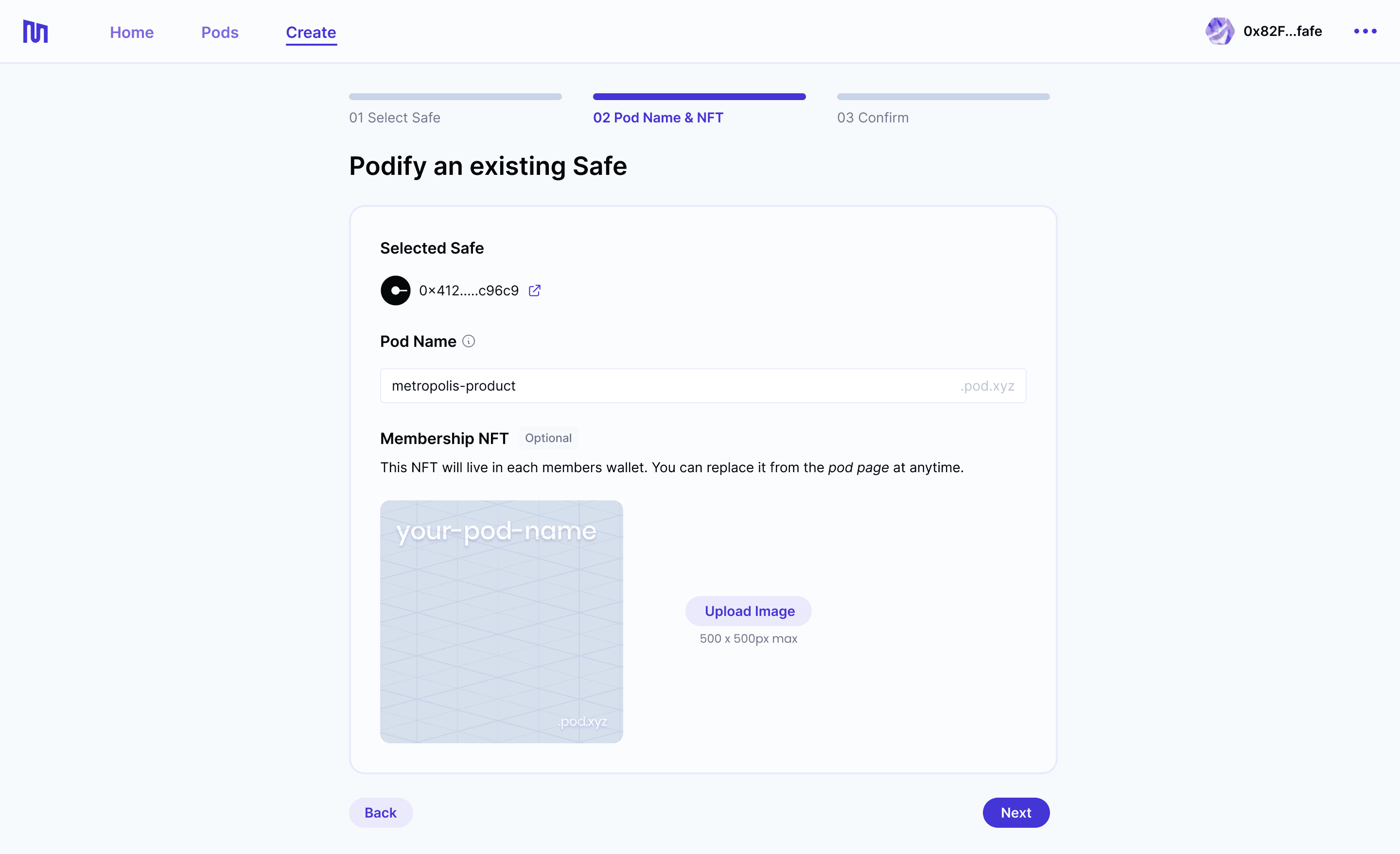
Step 4
Confirm and create

Creating a new team
Step 1
Set team name and profile photo

Step 2
Add team members

Step 3
Set team voting power i.e threshold

Step 4
Assign a team manager

Step 5
Confirm and create

Reduced time on task by 59%
Simplified member management
Improved copy and instructions
Progress bar to encourage users
Improved user feedback after actions
Reduced error rates by 38%
Improved error states
Confirmation page before creation
Improved member categorization

How might we generate awareness about our product launch?
As we were gearing up for launch, we partnered with the growth and strategy team to create marketing animations and static images for press releases and social posts. Our goal was to raise awareness and drive traffic to the app.
Key Learnings
Interaction design and stakeholder buy in
The biggest challenge with any project is getting stakeholder buy-in. To prevent interaction design (hover states, loading states etc) from getting overlooked, we worked closely with the developers early on in the design process to ensure successful implementation and buy-in.
Building trust using thoughtful onboarding
First impressions matter, after we added a dedicated onboarding flow with tooltips and accessible copy we noticed a significant increase in adoption. This helped the design team push for a global audit of copy across the board.
Copy and its affect on UX improvements
Accessible and understandable copy can make or break a UX flow yet they are the most difficult changes to get buy-in for. We leveraged research findings to push management to approve copy changes and it helped us reduce user error rates and increase engagement.
Outcomes & Results
Based on user testing sessions, we found that our new onboarding flow increased user adoption by 45%. Additionally, the new explore experience increased user engagement by 20% and a subsequent increase in traffic to
the new product offering – Podarchy Explorer. We saw an increase in engagement from both new and existing users with a significant increase in traffic from new users.
Where I lent a hand
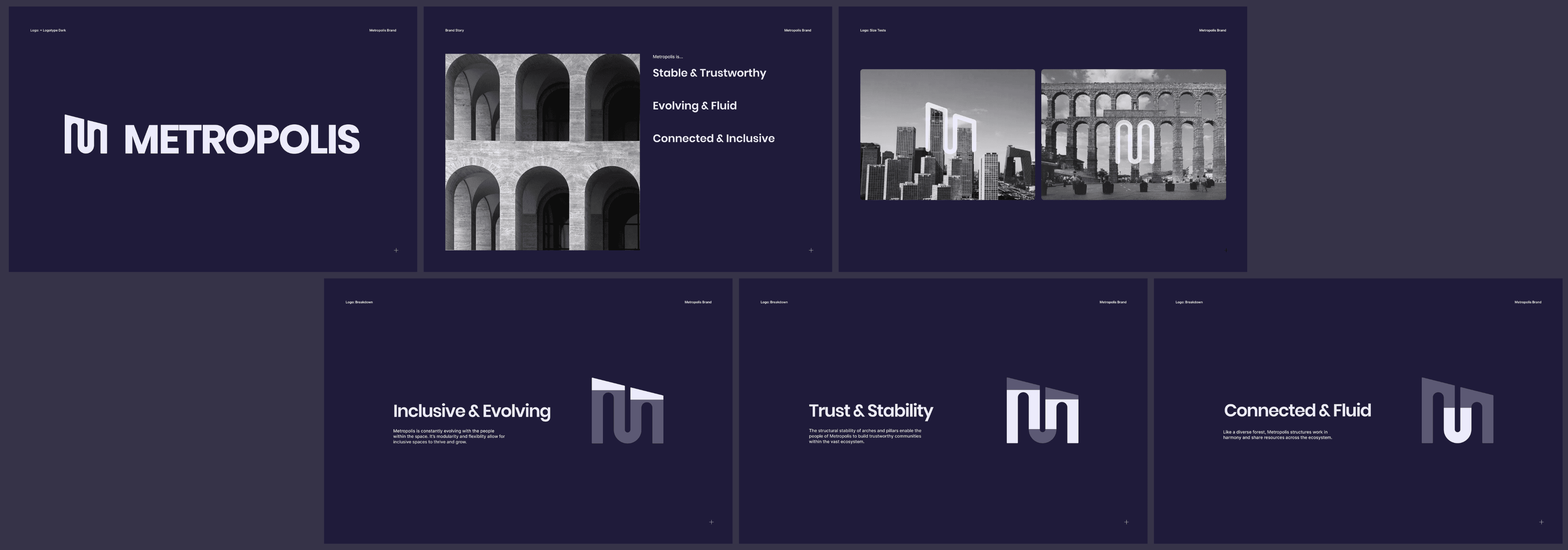
Metropolis Rebrand - Tone of Voice

Metropolis Rebrand - Visual Explorations

Metropolis Rebrand - Illustrations

Metropolis Rebrand - Marketing Assets
View next project

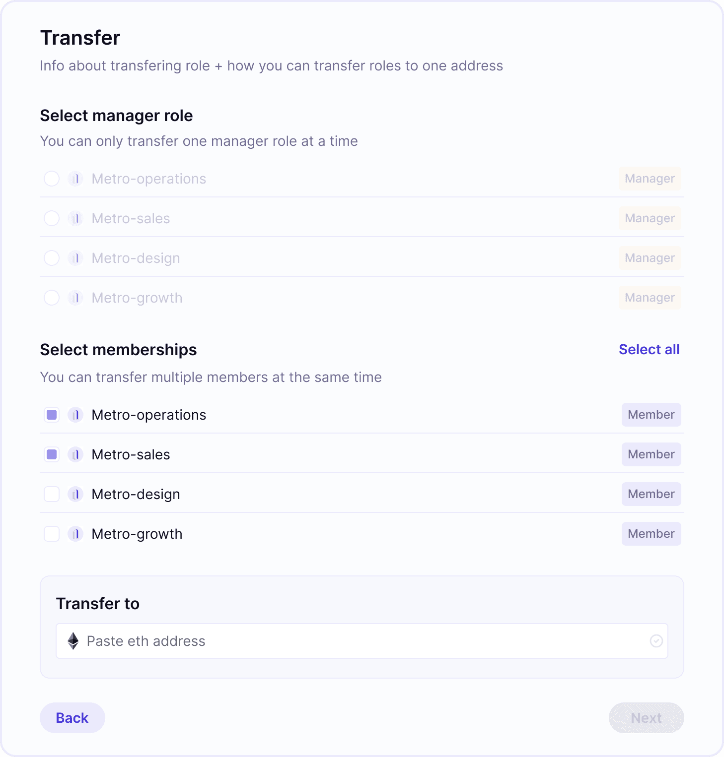

Admin management and permissions
Interaction Design
Let’s build thoughtful interactions for people together, let’s chat.
